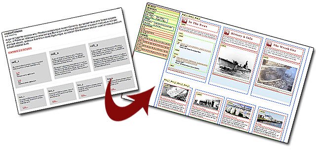
(In this Lesson we’re going to review an open-source template — you can download it for your own use, open it in FireFox, review a real website using the template, and learn about its hidden CSS “blueprint”.)
We will be using the excellent Web Developer FireFox Add-on by Chris Pederick — a must have FireFox extension for the Open Source WebMaster.
1. We pick a template at CSS Tinderbox, that uses a fixed 3-column over 4-column layout style. Huh? That’s exactly why we need Mr. Pederick’s tools — to see how this structure was built using CSS. In order to follow along with this follow along with this tutorial, download the template (click for download) and open it in FireFox — make sure you’ve installed the Web Developer (above link) Add-on, and restart FireFox first.
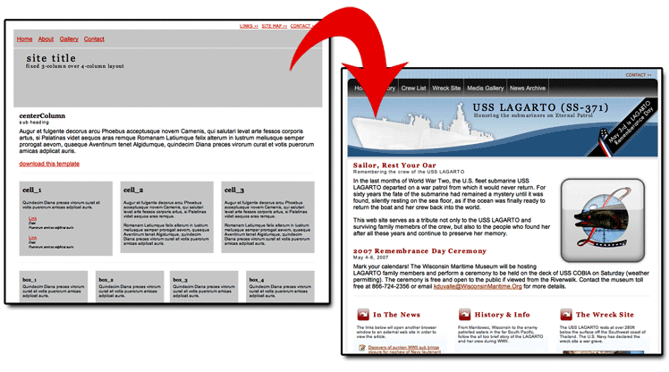
On the left is the actual Template available for download from the Tinderbox. At right above, is a site developed using that template (USS Largato site), which was linked to from the homepage of the Tinderbox.
2. We need to decide what structure we need to uncover in order to understand how the CSS controls the page layout. First, it would be good if we could see block level elements that determine content areas in CSS — elements like Divs, etc. This will quickly tell us how the templates’ underlying grid, or blueprint is set up. Next, we’ll want to check out some details about the CSS elements, like size, how they are placed and in what order, and any other relevant coding. Finally, we can take a look at an actual website created with the template and see how the images were placed into the layout.
3. Now we use the following tools from Web Developer to help show us this template’s blueprint.
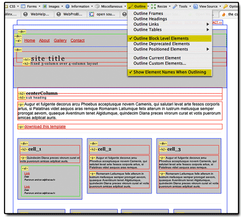
Above you can see the templates’ blueprint very well with the color-keyed (see notes above) outline of block level elements. You can also see what kind of an element creates each space by reading the yellow tags for each element. Note that DIVs are outlined in blue, Headings and Paragraphs in red, and lists in green.
4. But how were those small sets of three and four boxes accomplished? First clue… remember, this is a “Fixed” layout. Let”s use Web Developer to see exactly how that is accomplished in CSS. Take a look at the illustration below, and note there (and in the open template, if you’re following along with the downloaded template open in FireFox) the “Position” attributes for each box.
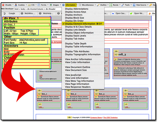
The answer to the question of how the small box content areas (three above four) are made in CSS becomes clear as you click on each box in succession, displaying the elements’ information and paying attention to its position coordinates. Watch how the “Left” pixel coordinates change for each box. For example for the first of the four small boxes at bottom, the Left coordinate is 221px (shown), while for the second box, the Left coordinate is set at 406px — meaning it is positioned at 406 pixels from the left of the browser window.
5. What if we want to learn more about how the CSS code was actually written? Easy. We’ll use View “Style Information” under the CSS Menu to take a look at specific elements in this template.
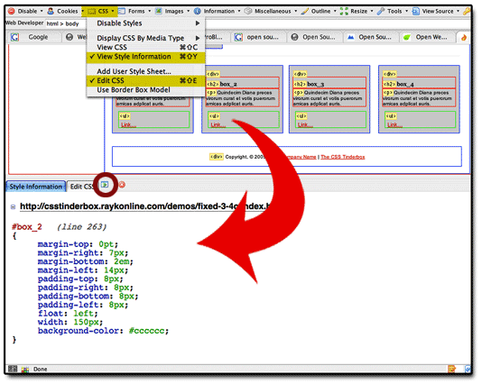
Once you open up the CSS editing box which appears at bottom of your browser window you will see a tab for Style Information (if you selected that feature), after you click on a CSS element on the webpage. Then, simply click on other elements for which you wish to see the code, and it appears for you — ready to copy and paste into another program if you wish. Note that you may reposition the placement of the CSS editing box to the left, top, or right of your browser window by clicking on the small icon to the right of the “Edit CSS” tab (circled in red above).
TIP: If you wish to experiment with changes to the CSS code, you can do so, and see an instant result! Just use the “Edit CSS” tab area that appears when you select “Edit CSS” under the CSS menu in the Web Developer extension.
6. Now let’s take a look at the site built using this template and see how images were added. A quick trick is to simply select “Hide Background Images” under the “Images” menu. In our example, this tells us right away that the picture of the ship at top is a background image.
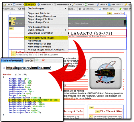
Hiding background images tells us which element contains a background image (if any), then we can get style information for that element and see the exact code written for its “background-image” (hi-lighted above). Using the technique from the last step (Step 5), you can open CSS editing and style information, click on the DIV where the picture was and see the code for that DIV with a line of code for the background-image (hi-lighted above).
There you go… an easy way to visually understand a template’s layout structure and access its CSS code, thanks to an excellent plug-in program for FireFox.
About the Author: Scott Frangos is a web developer, college instructor, illustrator, and graphic designer. He is Managing Editor for WebHelperMagazine, and is also writing two forthcoming books for Web Masters. He lives in Portland, Oregon with wife and partner, Pepper, and their three dogs: Wisdom, Spirit, & Steggman.